Nádia Canovas
Starting her career as a nutritionist, and with the purpose of making significant and effective changes related to healthy habits for patients, through real and simple ways, Nádia brought us the challenge of developing a visual identity, translating a message of lightness, credibility, freedom and transformation.
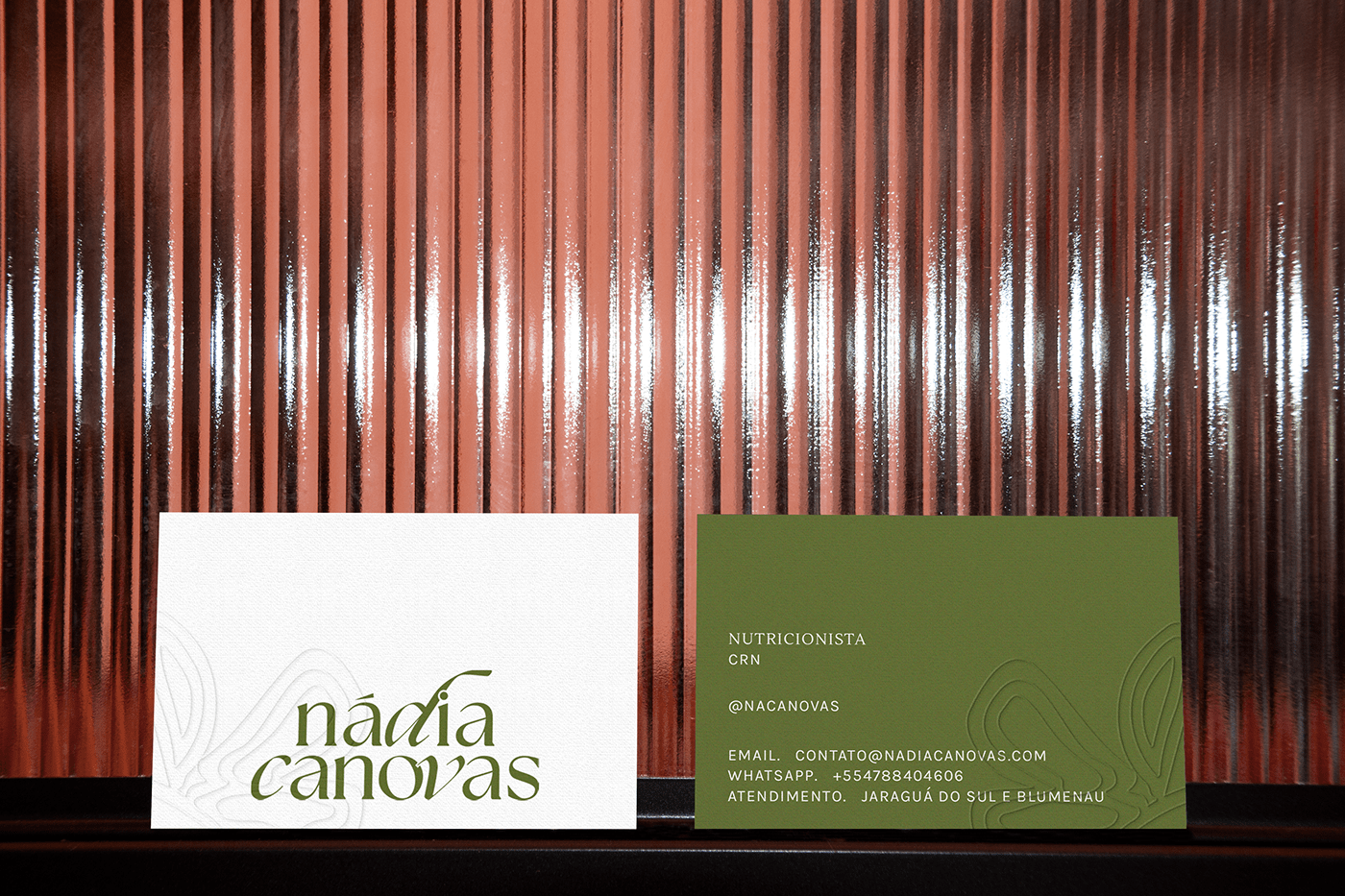
The graphics, composed by lines that bring movement and following the shape of a butterfly opening its wings, brings references to the symbol that represents the butterfly effect, following the thought that "small changes in a system can cause significant results" (such as adopting healthy habits).
The green and pink being the main colors, the secondary ones brought to the palette a greater variety of colors due to the applicability versatility in digital and printed materials.
The logo, with curves, thick contrast and two different fonts, brings sophistication and personality to the brand. The letters “d”, “c” and “v” give more contrast and prominence, as they are italic and personalized, attracting attention but even so, because they are distributed proportionally, they bring comfort to the look. It speaks to the entire identity and with its primary and secondary typefaces, adding a modern twist to the whole project.